In my sketch book, I identified some of the main art movements; Bauhaus, Constructivism, Art Deco and Minimalism, I also researched a few designers and artists and explained their work and how it fits into these movements.
Wednesday, 21 September 2016
AIM L2 - Design issues and 3D project evaluation
The design brief was to create an article covering issues that effect the design industry with a slogan/ banner that I have created using 3D visual communication techniques, after doing research into the different types of issues in different areas like fashion, textile, product and graphic design, I chose to investigate further into the issues of Fur in the fashion industry, the treatment on workers in cotton mills and the treatment of workers in China working for large companies such as Apple and Samsung. The slogan I created had to reflect all of these issues so after researching and experimenting with different phases and words I chose the phase "To die for" as I felt this reflected well on all the issues I was covering.
After finally settling on a phrase for my 3D slogan, I tested different ways of creating it starting with just a few letters, firstly I experimented with modroc just to create a 3D base of a letter that I could then build on top of with mediums like fur or plush animals, I wanted to slogan to represent my article in the way it looked as well as in what it said. I also experimented with paper a lot; folding, sewing, cutting and gluing it to get different results, I liked the effect that stitching the paper together with thick cotton gave as it represented the cotton mills well but I struggled with the paper tearing and struggled to get the letters to stand up and keep their shape. I chose to start experimenting with creating shapes and objects that I could use as my logo, with or instead of letters and I liked the cube cage I created as it linked to all my issues well, I then went on to figuring out how to get my slogan into the cage with it still looking like a cage but the slogan also being actually legible, I had to do a lot of experimenting and testing with this to come up with a lot of different ideas, many of which did not work either with the trouble of not standing up and keeping its shape or not being clear or legible to what it is or what it says, when I came down to my last 2 designs that I was pleased with, I created and photographed both of them, chose the photo I thought was the best and was very happy with the results.
I chose not to edit the logo in photoshop as I initially planned as think the lighting and shadows I achieved from photographing it were perfect and I wanted to keep it simple.
When creating and laying out my article, I chose to use InDesign, which is a program that is completely new to me, but I used my knowledge on Illustrator to figure it out the best I could as I found they are very similar. I wanted to structure of my article to look neat and professional so I used the guideline and margin tools to assist with that and keep everything in proportion, I used to frame tool to plan out where I wanted my images to fit around my text and spend some time just editing and tweaking parts of my article so that each paragraph would fit each column perfectly starting on a new line. The images I chose to include in the article show the dramatic contrast of the luxurious pelts worn in the fashion industry and the gruesome way they are farmed.
Overall I am very pleased with my finished project, I spent a lot of time researching different areas in depth to get the best possible results and testing out lots of different ideas instead of just going for the first one I had. I also think I managed my time very well and didn't panic or need to rush at any point and as a result of that my project is complete, detailed and professional looking.
Wednesday, 7 September 2016
AIM L2 - Unit 2 - 2D Visual Communication - NVQ 7501 - Create Visual Designs.
Create Visual Designs
3.2
|
Secure agreement with the relevant people on the final design concept
My client (Tutor) liked the idea of using flowers to make the book feminine and more appealing to younger girls even in a classic Art Deco style, we agreed that the design must follow a certain colour theme which fir in with both the Art Deco style and the feel of the book, and must also have a clear legible title that is in a font that can be read by people of any age and isn't too confusing.
| |
3.3
|
Ensure the selected final design technique meets the requirements of the brief
The brief was to create a book cover based on a children's story using a specific movement for inspiration, the story I chose was Anastasia which meant the book had to be appealing to young girls mainly and parents and the movement I chose was Art Deco which meant it had to be in that style. The final design met all of these specifications and functioned properly as a book cover.
| |
| 4.1 | Produce the design in the format agreed with the client I printed my final design to the correct size for the book I wanted it to fit, making sure to add extra panels to fold inside and my book cover was finished and met all the specifications of the clients brief. | |
| 4.2 | Review the design to ensure it meets the design brief and technical specifications and Undertake any modifications if necessary The design meets all the required specifications; - Art Deco style - Appealing to young girls - Appealing to parents - Feminine - Reflect the story - Function as a book cover The only modifications that were required were a spelling error on the blurb of the book cover. |
AIM L2 - Unit 4 - 3D Visual Communication - research trip
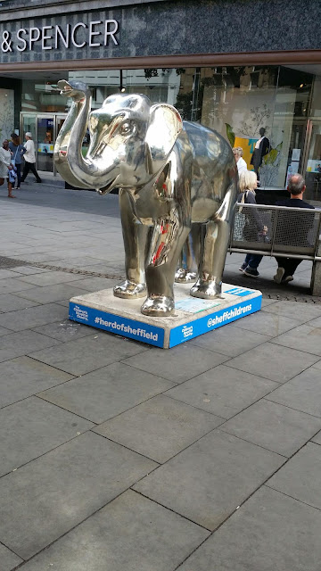
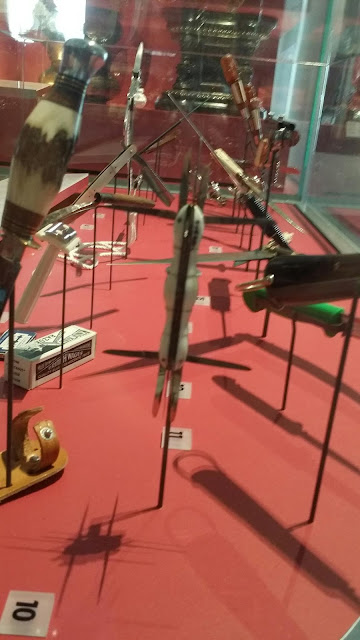
As Research for my 3D Visual communications unit, I took a trip to Sheffield to visit art galleries so I could see other artists examples of 3D work.
I collected images of as many elephant sculptures as I could as there were a lot around in different styles and designs and I felt that they would help for inspiration and ideas for my article slogan as it involves the slaughtering of animals.I also photographed any other 3D sculptures that interested me and that I felt that with further research into them would help me to create a unique and effective 3D slogan.
Subscribe to:
Comments (Atom)


